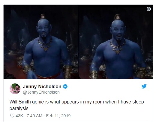
Last week, Disney gave us our first look at the live-action Aladdin. The sight of an all-blue Will Smith ended up becoming the biggest conversation about the trailer. A character voiced by the iconic Robin Williams in the past, Aladdin’s Genie had always been blue in the cartoon series. Unfortunately, the blue-skinned Will Smith found himself as the butt of many social-media jokes!
How often do you check your smartphone in a day? One would assume at least twenty to thirty times. While swiping through your notifications and communicating over your device, have you ever noticed the colour of your icons? Go do it now. Which is the most common colour that you spot?
The answer, in most cases, is going to be BLUE!.
Here are two screenshots. The one on the left is from my phone from last night. The one on the right is from a friend who took it in 2014.
![]()
All the Big Names in Tech Love Blue!
Apple seems pretty fond of the blue colour. Safari is blue, the App store is blue, the default Mail app is blue. iCloud backup is blue, the default video player app is blue, the weather app is blue, Apple support is blue, Keynote is blue, the ‘Files’ app is blue – and the list goes on.
I use an iPhone but Android apps are no exception to this. The default apps for calendar, news, messages, clock, docs, downloads, calendar are all blue! The default calling application is also blue. The Google app by itself used to be blue until recently when Google introduced the multi-coloured ‘G’ icon a few years ago.
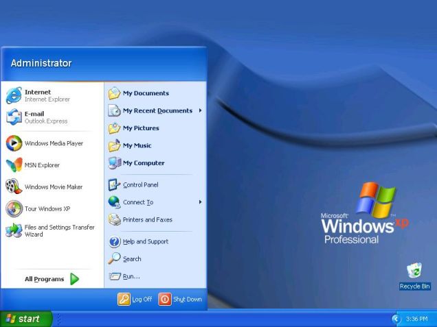
The PC isn’t an exception either. Microsoft loves blue. The default background in the 90s was just one giant block of solid blue. Windows XP was all about the magnificent blue skies and the big blue taskbar! There’s the blue internet explorer (which has now made way for the blue Microsoft Edge!). The Microsoft logo started off as four blue blocks – then got a few more colours – but returned to the four blue blocks in Windows 8. Moreover, there’s also the infamous Blue Screen Of Death on Microsoft! (A number of other Microsoft-owned properties are also heavy on the blues: LinkedIn, OneDrive and Skype to name a few).
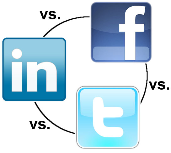
Facebook is blue, Twitter is blue, Skype is blue, Messenger is blue, Telegram is blue, Safari is blue, LinkedIn is blue, Truecaller is blue, PUBG is heavy on the blues, the default mail app and app store are also blue. Practically every unclicked link on the internet is blue by default. The buttons on WordPress, the platform on which my blog is, is also blue!
However, each of these shades of blue are different from each other, and chances are that you can easily differentiate between Twitter’s Blue, LinkedIn’s Blue, Skype’s Blue and Telegram’s Blue! All of these tech giants essentially have the same colour but various shades which they have made their own.
Interestingly, when Mark Zuckerberg was asked as to why he chose blue to be Facebook’s primary colour, he said that this is because he is red-green colour blind. Hence he went with blue. However, there might just be more to that than just Zuck’s personal quirks.
Blue Light is why You Can’t Sleep!
It’s not just about the colour blue – but also the blue-wavelength light that modern-day devices emit that needs to be addressed.
Smartphones and laptops, as well as a number of other light-emitting devices, tend to emit light in blue wavelength. Light in this wavelength is useful as a source of artificial light in the daytime and is also beneficial when it comes to viewing at a screen during sunlight. However, at night, the blue wavelength that these artificial sources of light emit can disturb the circadian rhythm – causing problems related to sleep such as insomnia or disturbed sleep patterns. The basic reason for this is that as humans, we have been conditioned for millions of years with the Sun as the only source of light. However, artificial light over the past few hundred years has impacted that basic evolutionary trait.
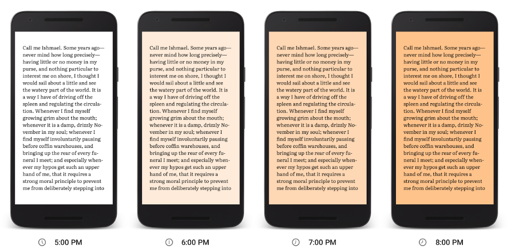
This is the reason why in recent years Android, iOS and Microsoft have all released a ‘Night Light’ mode which creates a warm-light effect on the screen by giving it a yellowish tint after the sunset. Interestingly, talking about blue light, Japan has found that using blue lights can help reduce suicides. But that’s a different kind of blue light.
This National Geographic article talks about lights and their impact on sleep in great detail.
Why So Blue?
Harsh Kansagra, a full stack designer and the co-founder of Ahmedabad-based design firm 7Span comments on why blue is the preferred colour of the internet:
“The reason the blue colour is preferred by brands over others is because of basic colour theory. Basically, blue is neutral & calm. It is not strongly associated with any object, theory or category. For example, red represents ‘danger’, ‘warning’, ‘non-veg’ & ‘medical’, which may have a negative impression on some people. Same goes with green. It is strongly associated with ‘nature’, ‘freshness’, ‘food’, ‘eco-friendly activities’ & ‘vegans’. Blue, however, is the colour which does not trigger strong emotions and safe for use for brands which does not fall in the above categories.”
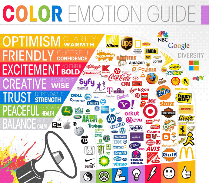
Colour theory gives various explanations as to what the blue colour indicates. Various shades of blue are associated with various qualities and emotions. Lighter shades of blue are associated with peace, clarity and calmness. Darker shades of blue are considered to be more business-like as they stand for authority and intelligence. The colour instils a sense of tranquillity.
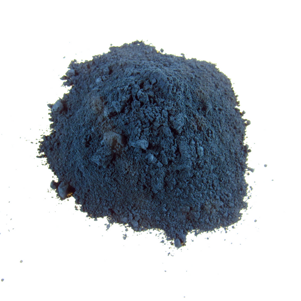
One of the most basic reasons as to why blue, as a colour, appeals to most users is because of the basic evolutionary trait. For millions of years, humans have known the sky above them to be blue and the waters ahead of them to be blue. The far away mountains look blue, some twinkling stars appear to be blue. Many of the earliest civilizations such as the Indians and the Egyptians have Gods who are blue. (Not surprising considering these are the two regions which were the first to cultivate the Indigo dye).
Early homo sapiens crossed the great blue oceans and spread across continents. (Ironic considering most languages never really had a word for the colour ‘blue’ until much later. Homer famously described the oceans as Wine-Dark). Blue exists in abundance in nature. Maybe this is also why blue exists in abundance in tech.
I’d conclude on a rather poetic note. In my early days on Twitter, I saw a beautiful Hindi couplet Tweeted by NDTV journalist Ravish Kumar. Here’s a loose English translation of the same:
We are the descendants of indigo farmers/ maybe that is why the blue colour of the skies attracts us.
When I look at the paintings of the impressionist painters, say Van Gogh, I am amazed at how blue (cool colour) is used against warm colours like yellow to express relative distance.
Intersting article. I have n numbers of blue shirt 👕 and now I know reason why.
The more you know. Never realized so much goes into colour selection.